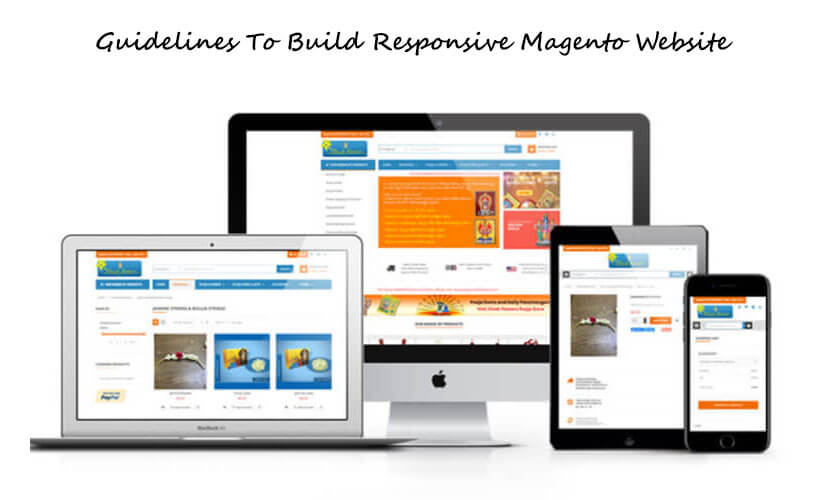
Extensive guide to build Responsive Magento Website
Undoubtedly Magento is amongst the most appreciated and liked e-commerce platforms.
Magento is an incredible open-source platform for all eCommerce SEO websites and helps manage and get control of your online store.
In case you are not familiar with eCommerce, then opting for Magento would not be easy. Well, getting a responsive Magento site is important and RWD which is also termed responsive web design lets you create websites that fetch optimum recognition across multiple devices with a high, large resolution like mobile phones, desktops, etc.
The extraordinary themes that use the concept of RWD are
- Magento Blank theme
- Luma theme
These themes use JavaScript and CSS to create a responsive website design.
Hence, the Blank theme is recommended as the initial step for the customizations. It means the custom theme you choose needs to be extracted from Blank.
This frontend website development guide would help you know about the methods implemented in the Blank theme and offer some practical insights into using the methods in your themes.
CSS in Magento responsive design
When it comes to responsive web design, a style sheet is a primary tool in its execution. You will learn the system and methods to create RWD utilized in the default themes of Magento. Now, to use them again in the custom theme, ensure the theme takes it from the theme- Blank.
Mobile-first vision
Talking about Blank & Luma themes, the idea of “mobile-first” is much focused on and the sequence is like
- mobile
- tablet
- desktop
Well, this means the styles for different mobile devices with a screen width below 768 pixels are expanded by the styles specifically for higher breakpoints. It prevents the overload of extra styles when the store is seen on a mobile.
JavaScript in Magento responsive design
Here we will talk about how JavaScript is utilized in incredible Blank & Luma themes to shift some components to modify their action based on the breakpoint.
Responsive.js
The script – responsive.js executes certain responsive functions for both themes (Blank & Luma).
To control JavaScript for mobile/desktop view, responsive.js calls the following
mediacheck() unknown feature from matchMedia.js.
Magento scripts – Re-use in the theme
To include responsive behavior in the custom theme you can utilize
- menu.js,
- responsive.js
- matchMedia.js
In case your theme is extracted for the Blank/Luma theme then you will not need to include the script files separately in your theme.
In case your theme is not extracted from Blank/Luma, then to make use of scripts you need to configure RequireJS for the theme.
Customizing RWD: illustration
In this section, you will get step by step explanation of how to modify the count of products portrayed on a catalog page in a particular row, and maintain the RWD approach executed by Magento themes.
The flow stated below is ideal for all the themes that come from Blank & Luma themes.
Alter the count of products present within a row
Some e-store owners wish to focus on making their products visible by reducing the count of products displayed in a row on the catalog/product page. It helps each product get more room.
When it comes to the standard Blank theme, the count of products present within a row, particularly for every breakpoint is as follows
- 1024pixels and above for desktop – 4 products
- 768pixels for tablet – 3 products
- 640pixels or less for – mobile- 2 products
Within the custom Orange theme, they wish to have a minimum count of products within in a row especially for the tablet, desktop & tablet view as
- Desktop -3 products
- Tablet- 2 products
- Mobile -2 products
Well, the orange theme extracts from the Blank theme.
Create a responsive mobile theme based on Blank
Build a responsive theme for mobile which is based on a default theme
Here, you will learn to create a responsive theme for mobile with the help of default Magento features
Create a mobile-based theme
If you wish to make use of responsive steps in Magento Blank & Luma themes, then your theme needs to consider one of them to be a parent
Apart from following the Magento approaches stated above while using a Blank or Luma theme here are some generic steps that you need to learn while building a responsive Magento website.
Select a Magento theme
Well, the first thing that you need to do before you plan to have a responsive Magento site is to select the latest Magento 2 theme to kick-start e-store creation with an off-the-shelf professional design.
Well, advanced Magento themes offer a lot more than the off-the-shelf UIs.
If you purchase the best Magento templates offered by well-known providers, they provide an amazing user experience with more than one niche-related UX boosters and extensions.
When selecting the right Magento theme for your business, pick the one that offers the features given below features:
- Cross-browser compatibility
- 100% responsiveness
- Improved navigation, for example, Layered navigation, Megamenu, etc
- Distinct ready-made layouts for, Gallery, store pages, and Home Page
- RTL support (if needed)
- Blog feature
- Advanced slider, Parallax
These are a series of functions you can discover in a well-created Magento template. So, do not settle for less as each latest Magento theme needs to deliver the best.
Also, multiple new Magento themes are released with fast loading and extraordinary features like AMP (Accelerated mobile pages).
In case you can get a design that matches the features like AMP, then just pick that theme as AMP is an effective feature that multiplies the conversion on mobile devices.
Be ready for Installation
After you have bought the theme, check for any hosting/software needs it comprises.
To run a Magento store successfully, you will have a perfect hosting plan with modern PHP.
You can check-out out different plans with professional Magento hosting service providers like
- Bluehost
- Inmotion Hosting
- A2 Hosting
- HostGator
- SiteGround
The software you may need is –
- Adobe Photoshop – It lets you help work with .psd sources for eh templates and also with imagery and graphics.
- Also, you will need software like
- Sublime Text
- Notepad++
- Adobe Dreamweaver
Well, you can also establish your site without even engaging in coding.
Install Magento & Template
Now, it is time to create your online store. Move to Magento Tech Resources and then download the version of your choice for the engine.
You need to upload the files and build the database to the server to install the engine. Then feed in the address of your new website in the browser and you can view the Magento Installation Assistant.
Configuration of your online store
Now you need to start configuring the store for which head to the content section. You can see the Widgets, Posts, Pages, Blocks, and comments in the sub-menu.
All these options let you
- Modify the pages
- Add the pages
- Add Blocks
- Add Widgets
You can use these features to modify the layout and include fresh content in the e-store.
Below the menu tab – Content, you can view – Configure item. Here, you can modify the count of store options which includes the footer, header, product watermarks, and pagination display, etc.
Start creating new products
Undoubtedly, products become the backbone of your e-store. With Magento adding products to your store is quite easy.
Additional Configurations
Well, there are more aspects that you have to consider before you try to make your site go live.
Your objective is based on the niche & extensions you implement in your e-store. Hence, some of the store configuration factors that you need to consider related to store configuration are-
- Give out links to your social media accounts on distinct social media platforms. It will let the users follow you through the social media networks they are using.
- Include a contact form on your site and modify the Google Maps address.
- Include a few articles in your e-store in the Blog section. Continue to add some more once your site goes live.
- To expand your network of clients, install new languages and then translate your website Install new languages and translate your website
- Now, configure the navigation located at the top of your website thereby adding MegaMenu panels to enhance usability.
- Next is to configure payment methods and tax rules, shipment methods, prices, etc.
Make sure you accept payments from well-known providers like Mail Chimp, Paypal, Google Shopping, etc.
The mobile versions of all Magento websites are updated and completely optimized. You need not bother about building responsiveness, images, page layout, videos, etc as they are already present for you.
So, having a mobile responsive Magento site is affordable and easy to build and set up. You don’t need individual themes or apps for mobile devices. You can just decide to create a responsive Magento site and get started with generating revenues for your business.


